I’m not going to start this post with a story about how every time I see my friends and family, we’re all on our smartphones, ignoring one another.
You already know people are glued to their phones. You know that this includes your customers.
You know we search for local businesses on smartphones. Maybe you even know that 82 percent of smartphone users look up information on their phones while they are in a store contemplating a purchase decision.
And you’ve probably been to a website on your phone only to leave frustrated because the site wasn’t optimized for your device.
But, did you know that while 56 percent of traffic to the leading websites comes from mobile devices, only 50 percent of small business websites are optimized for mobile devices?
Seems counter-productive, doesn’t it?
And only 60 percent of small businesses even have a website, but that’s a story for another day.
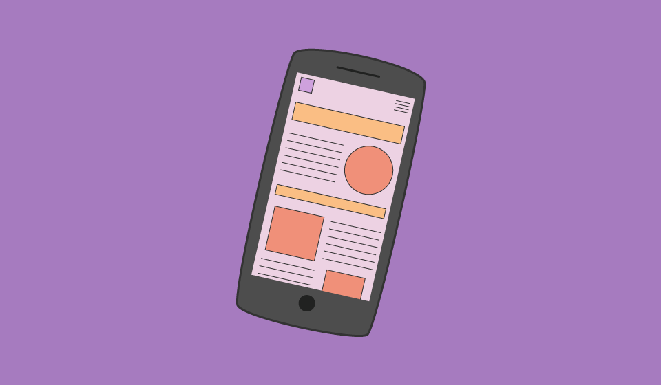
Mobile optimization is a digital marketing buzzword that means a website is designed to adapt to the device the consumer is using to search for your business.
Why do small businesses need mobile-optimized websites?
Well, both search engines and the people who use mobile devices to search for local businesses favor mobile-optimized websites.
Last year, mobile internet usage surpassed desktop.
Besides, imagine it from a consumer's perspective. If I’m on my phone searching for a place to eat near me, and I click a restaurant’s website only to find the menu is tiny and the site is difficult to navigate, I’m going to move on to the next business.
I’m not the only one. In a survey, 91 percent of consumers said they've turned to a business's competitor if the business’s website wasn’t optimized for mobile devices.
Seriously, mobile optimization is important:
Mobile optimization isn’t just important for consumers, though. Search engines favor mobile-optimized websites too.
I know you want your business to rank high in searches.
But did you know that search engines will penalize websites if they aren’t mobile-friendly? In April 2015, Google updated its search ranking algorithm to reward mobile-friendly websites. Websites that weren’t mobile-friendly eventually saw a decrease in search rankings while the mobile-optimized sites tended to see an increase in rankings.
And in May 2016, Google tweaked this algorithm so that mobile-friendly websites got an additional boost in search rankings.
So, if your website isn’t easy for consumers to use on their smartphones, search engines will lower your search rankings, making it harder for consumers to find you.
How does Google define mobile-friendly? Here's the definition from Google's Mobile Terms Glossary:
"Usable on a mobile device (e.g. the site doesn't slow down the phone, doesn't scroll horizontally in a vertical orientation, doesn't use unavailable plugins like Flash). It's designed for the form factor of the device and its display."
Mobile-optimized websites have font that is large enough for consumers to read as well as clickable links or buttons spaced far enough apart that users don’t have trouble clicking the right button. And there is so much more that Google takes into account when determining if a website is mobile-friendly.
And Bing has similar criteria for judging the mobile-friendliness of a page.
Factors include:
Bing and Google both have mobile-friendly testing tools for websites. Just copy and paste your website’s URL and click “analyze” to see how your site stacks up.
Google recently updated its mobile-friendly testing tool. You can also check out Bing’s mobile friendliness test here.
Final Thoughts
If your site isn't currently optimized for mobile, then it's time to do a website revamp. In 2017, there's no excuse for clunky, old websites that don't load (or are difficult to use) on mobile devices.
Talk to a web developer and a designer about optimizing your website for mobile devices. Don’t lose customers (and money!) to competitors just because they can’t navigate your site on their smartphones.
P.S. This is also something we can do for you! Our local search marketing services come with a mobile-friendly site!

Isabella Andersen, Content Contributor
Subscribe to our email list to get the latest digital marketing content delivered to your inbox each week!
![45 St Patrick’s Day Phrases to Charm Your Customers]](/images/Blog%20Images/2025/February/45StPatricksDayPhrasesToCharmYourCustomers_BlogGraphic_CMS.png)