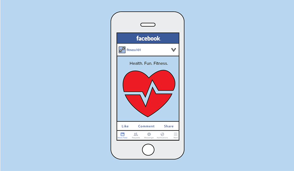
We have an exciting update for businesses that advertise on Facebook!
Facebook has changed its policy about the amount of text it will allow in ad images. There have been rumors of this change floating around online for a while, but it’s been officially available since June 8.
We are seeing the new ad text rules reflected in
Facebook Business Manager now, but the feature is being rolled out slowly. So not everyone will see it right away.
What has changed?
Previously, for an ad image to be approved, it could contain no more than 20 percent text. Facebook provided advertisers with a (slightly frustrating) grid tool to estimate the percentage of text their desired ad image contained.
Anyone who used the tool was likely disappointed on numerous occasions when, upon passing Facebook’s preliminary examination, their image was still rejected after the final ad was reviewed.
What’s Facebook’s new ad text policy?
The new policy regarding text in Facebook ad images is less of a rule and more of a guideline. Instead of being approved or rejected, the image is given one of four quality ratings: OK, low, medium and high.
Here's what it looks like when Facebook rates one of your ad images:
The top image is rated high because of the high amount of text, while the bottom image is rated low since there's very little text.
And here's a breakdown of the four ratings:
1. Image Text: OK
"OK" is the best rating possible, so it's where you want your ad to fall on the rating scale. This means the image contains little to no text. With this score, your ad’s reach will not be restricted due to the amount of text in the image.
An example of an image that would receive this rating is an image with no text except a small company logo.
2. Image Text: LOW
Images that receive a “low” rating probably have a small amount of text (less than 20 percent). If an image receives a “low” rating, your ad’s reach may be slightly limited.
An example of a “low” rated image is an image with a small text overlay that does not dominate the image.
3. Image Text: MEDIUM
An image that receives a “medium” rating will probably have a small amount of text combined with a company logo. At this point, you’re pushing it and your image is probably looking a bit crowded.
Your reach might be reduced due to the amount of text present. It’s not that Facebook won’t display your ad at all, but it might still be a good idea to reconsider the amount of text your image has at this point.
4. Image Text: HIGH
An image with a “high” rating probably has a large amount of text. If your image is rated “high,” it has too much text and will not reach your target audience unless an exception is granted.
Facebook explains the new policy in its
Advertiser Help Center, saying that less ad text is still preferable but that ads will not be rejected just because of the amount of text in an image.
What you see in the image above is an ad with way too much text. Facebook is warning us that the ad may not run because of the amount of text in the ad's image. So steer clear of this type of ad and stick to less text.
Here’s how Facebook explains the new policy:
“While [ads] with minimal text are still preferred, we've adopted a new system that allows you to run ads that would've been rejected under our old policy. With our new system, ads with higher amounts of text will receive less or no delivery at all (unless we apply an exception).”
The types of text-heavy images that might receive an exception are:
- Movie posters
- Book covers
- Album covers
- Product images (if an entire product can be seen, and it’s not just a zoomed-in image of the product)
- Posters for concerts/music festivals, comedy shows or sporting events
- Text-based businesses: Calligraphy, cartoon/comic strips, etc.
- App and game screenshots
- Legal text
- Infographics
This change still encourages advertisers to continue to find high-quality ad images. But it does allow for a little more wiggle room if the perfect image for your Facebook ad is slightly more text-heavy.
The ad could still be restricted, though, so keep that in mind when adding text to your Facebook ad images.
Why does this matter?
This can directly impact your bottom line. Ads with less text are less expensive and better performing than ads with more text. If you want your ads to perform well and reach a larger audience for a lower cost, the percentage of text in your ad images is important. So keep Facebook's guidelines in mind when adding text to images.
What can you do to make sure your ad’s reach isn’t restricted?
The important thing to consider when creating an image for a Facebook ad is to keep in mind what Facebook is really looking for:
Your image should be, well, an image.
While it may be tempting at first to place a copy of a flyer-like image containing your offer and several lines of disclaimers, that’s not your best bet for success.
No matter how you define a conversion for your Facebook ad (a form submission, a phone call, a scheduled appointment, a class, etc.) ask yourself what the ad’s role in your conversion process is.
The ad is really just a way from the viewer to get from the social media platform (Facebook or Instagram) to your website or landing page. Once they get to the landing page, they can educate themselves and convert, so don’t worry about stuffing your ad full of information.
Tips for choosing an appropriate ad image and text:
1. Choose an image (or images) that catches the viewer’s eye and piques their interest enough to stop scrolling through their newsfeed and investigate further.
3. Make use of headlines and captions.
Facebook allows you to write a 25-character headline, 90 characters of text above your image and a 30-character link description (which is shown below your headline). And in some placements, such as in Facebook newsfeed on desktop devices, you may actually include almost double these character limits.
This allows more than enough room to communicate an offer, description of service, important disclaimer, etc. Best practice is to save the text for these locations and leave it out of your image.
4. Save the fine print for your landing page.
So you’ve maxed out all character limits and still have more to say?
That’s not a problem! Again remember the conversion process. It doesn't necessarily end when someone simply reads your ad.
Instead, draw their attention with an image. Pique their interest with 140 or so characters of text, and send them to a conversion-optimized, mobile-friendly landing page, such as a microsite from RevLocal.
That should be where they can find the full details of your business, offer/promotion and disclosures as well as options to convert such as directions widget, sign-up form, mobile click to call button or printable coupon.
What does this mean for your small business?
While the full impact of this change is still unclear, at RevLocal we take pride in being ahead-of-the-game on all things related to Facebook advertising and digital marketing.
We’ve been on top of the new guidelines since we started noticing the changes. And we always strive to create high-quality ads with compelling images and text to give our clients the competitive edge.
With constant research, testing and strong relationships with channel and vendor support, we are able to provide the most cutting edge and effective marketing and
paid advertising strategies to all of our clients.